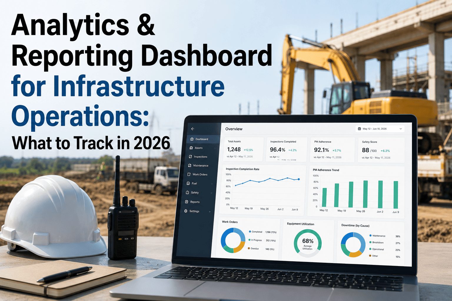
Infrastructure operations heads in 2026 are drowning in data and starving for insight. GPS pings from tippers, fuel receipts from mining sites, PM logs from workshops, DVIR photos from drivers, compliance certificates from HR, and hire-vehicle invoices from vendors all pile up in six disconnected systems, and by the time somebody merges it into a Monday spreadsheet, three trucks have already broken down and one fitness certificate has expired. A well-architected analytics and reporting dashboard fixes this by promoting the four numbers that actually move margin to the top of the screen and pushing everything else one click deep. This guide covers exactly which KPIs to track, how to tier them, and what benchmarks to chase, so book a walkthrough with our team via a quick 30-minute demo once you have the shortlist ready.
Analytics & Reporting Dashboard for Infrastructure Operations
The KPIs, benchmarks and dashboard structure that separate infrastructure fleets beating industry cost per km by 30% from those still exporting CSVs on Friday evenings.
The Cost Of Flying Blind
Every day without a proper analytics layer, infrastructure fleets bleed money in ways that never show up on the P&L until quarter close. Here is what the data says.
The Tiered Dashboard Architecture
The industry best practice in 2026 is not more KPIs, it is fewer KPIs shown with the right visual weight. Structure your dashboard in three tiers so a project head can go from "log in" to "I know which three assets need attention today" in under 10 seconds.
Glance Layer · 4 North Star KPIs
Visible without scrolling, without clicking, without filters. These four numbers predict where the fleet margin is heading.
Diagnostic Layer · 4-6 Supporting Metrics
One click deeper. These explain why the north star numbers are moving up or down this week.
Detail Layer · Everything Else On Demand
Site level, asset level, driver level breakdowns. Available on demand for audits, root cause analysis or vendor reviews, but never competing for space on the main screen.
The 12 KPIs Every Infrastructure Dashboard Must Track
Below is a working reference for infrastructure operations, mapped to what each number means, the 2026 industry benchmark, and where to look when it drifts.
Cost Per Kilometre
Single most correlated KPI with fleet profitability. Blends fuel, maintenance, driver, insurance and depreciation into one number.
Total Cost of Ownership
Captures every rupee an asset costs across its lifecycle including acquisition, fuel, maintenance, insurance and disposal.
PM vs Emergency Spend Ratio
Ratio of planned preventive spend to unplanned emergency spend. Higher planned share means fewer late night workshop calls.
Vehicle Utilisation
Active hours divided by available hours. Below 70% means idle assets, above 90% risks throughput when a vehicle fails.
Unplanned Downtime %
Percentage of scheduled operating time lost to unplanned breakdowns. 78% of it is preventable with predictive alerts.
PM Compliance Rate
Percentage of scheduled preventive maintenance tasks completed on time. Below 80% correlates with 3.5 times more breakdowns.
Mean Time Between Failures
Average operating hours between two failures on the same asset. Rising MTBF is the cleanest signal that PM is actually working.
Driver Safety Score
Composite of harsh braking, over-speeding, night driving and fatigue events. Directly linked to accident probability and premium.
Accidents per Million KM
Normalises accident count against total distance so different sized fleets and different vehicle classes are comparable.
DVIR Completion Rate
Percentage of pre-trip and post-trip inspections completed on schedule with photo evidence. Direct input into audit readiness.
Certificate Expiry Exposure
Number of fitness, permit, PUC and insurance documents expiring within 30 days without renewal action triggered.
Audit Readiness Score
Composite of DVIR, certificate, PM and driver log status. Answers can we survive a surprise audit at 3 pm today, yes or no.
Turn Your Fleet Data Into A Live Dashboard
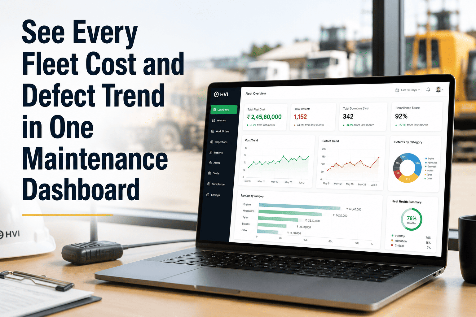
HVI pulls DVIR, PM logs, cost data, driver behaviour and compliance certificates into one live dashboard structured exactly the way this playbook recommends. Book a 30 minute walkthrough on your own project data.
Review Cadence By Role
A dashboard is only as good as the meeting that consumes it. Map each KPI to the right owner and the right rhythm.
| Role | Primary KPIs | Review Cadence | Action Trigger |
|---|---|---|---|
| Site Supervisor | DVIR completion, Downtime, Utilisation | Daily start of shift | Any asset red on morning huddle |
| Workshop In-charge | PM compliance, WO backlog age, MTBF | Daily and weekly | PM slip beyond 48 hours |
| Safety Officer | Driver score, Accidents per million km, Near miss | Weekly | Score drop beyond 10 points |
| Project Head | Cost per km, Utilisation, Unplanned downtime | Weekly review meeting | Cost per km up 5%+ over target |
| Compliance Lead | Certificate expiry, Audit readiness, DVIR | Weekly and monthly | Any document under 30 days |
| Business Head | Cost per km, TCO, PM vs emergency ratio | Monthly and quarterly | Trend inversion for 2 periods |
6 Dashboard Mistakes That Kill Adoption
The dashboards that fail rarely fail because the data is wrong. They fail because the design is wrong. Watch for these six anti-patterns.
Equal Visual Weight
Showing 30 KPIs in identical tiles forces the user to prioritise mentally, which nobody does at 8 am. Tier by importance.
Stale Data
A daily refresh is not real time. If drivers finish a shift and the dashboard still shows yesterday, nobody trusts it by week two.
No Traffic Light Status
Colour coded green, amber and red status is what makes a screen scannable in 10 seconds. Plain numbers demand interpretation.
Missing Drill Down
A KPI that cannot be clicked to see the underlying assets is a dead number. Every glance metric needs one-click detail.
No Role Filter
Site supervisors, safety officers and business heads do not want the same view. Role based dashboards drive daily use.
No Mobile View
Infrastructure runs on WhatsApp and phone screens. A dashboard that only works on a laptop is a dashboard nobody opens on site.
Quick Benchmark Cheat Sheet
Print this and put it above your workshop noticeboard. If your numbers are outside these bands, the dashboard is telling you where to look.
Frequently Asked Questions
Build A Command Centre For Your Infrastructure Fleet
HVI turns paper DVIRs, workshop logs and telematics feeds into one live analytics dashboard structured exactly the way this playbook recommends, tiered KPIs, role based views, mobile ready, real time. Start free or book a 30 minute demo to see it on your fleet data.